Why Businesses Pay for Analyst Quadrants
Firms like Gartner and Forrester charge serious money for reports that plot vendors on a simple two-axis grid. Buyers pay for the shortcut: instead of weeks spent interviewing twenty vendors, a single chart compresses hundreds of hours of comparative research into an afternoon read, using the same scoring rubric across every vendor so the comparison is apples-to-apples. It also doubles as institutional cover — recommending the vendor in the top-right quadrant is a safer career move than defending a purely independent pick.
Vendors pay even more. A "Leader" placement becomes sales collateral: the graphic goes on the homepage, into every pitch deck, and in front of every prospect as instant third-party credibility. Analyst-relations spend buys briefings and visibility, which is part of why critics note that placement can correlate with marketing budget as much as product quality — and why staying out of the report, when competitors are in it, sends its own signal.
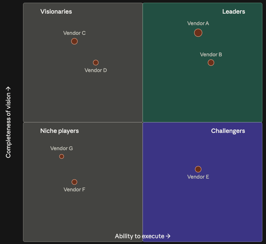
How to Read the Chart
Every version of this chart rests on the same two axes, relabeled by whichever firm produced it. The X-axis measures present-tense strength — can the vendor deliver today? The Y-axis measures future-tense strength — where is the vendor headed? That produces four zones: strong on both (safe, established players), strong vision but weaker execution (ones to watch), strong execution but less forward-looking (reliable but not pushing the category), and weaker on both relative to the field (usually narrow specialists).
References - Four Report Formats – Summary:
Gartner Magic Quadrant
A 2x2 grid plotting "ability to execute" against "completeness of vision." Vendors land in the Leaders, Challengers, Visionaries, or Niche Players quadrant based on briefings, customer references, and demos.
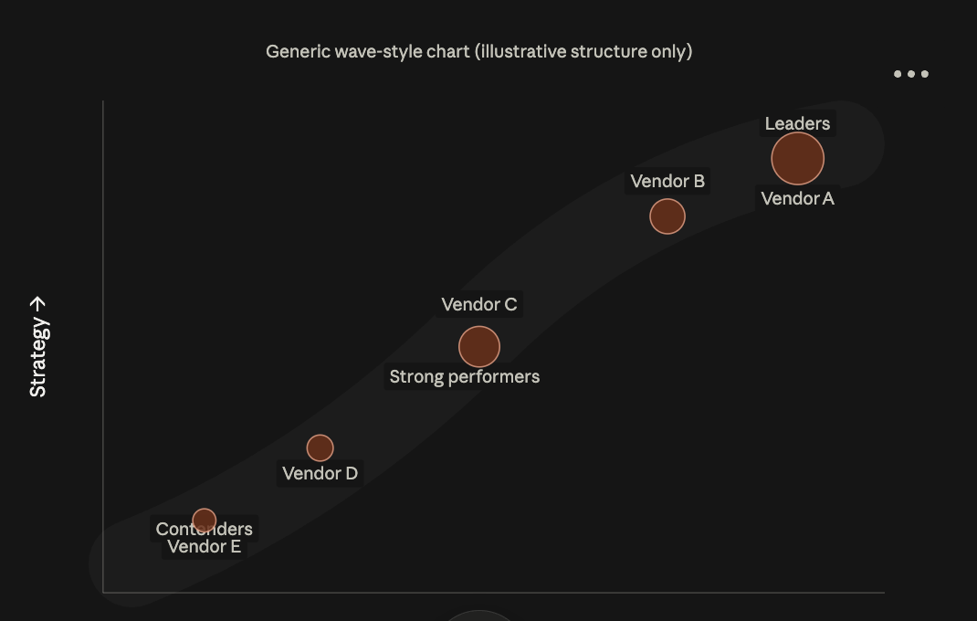
Forrester Wave
A wave-shaped scatter plotting "current offering" against "strategy," with bubble size showing market presence. Vendors ride the curve from Contenders up to Leaders.
IDC MarketScape
Structually, it is near identical to Magic Quad. A similar 2x2 layout scoring "capabilities" against "strategies," with bubble size representing revenue — just different labels.
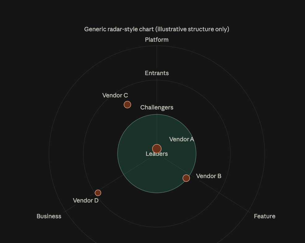
GigaOm Radar
A circular layout instead of a grid — maturity is shown by distance from the center rather than by quadrant position.
Methodology Critique
These reports carry real methodology debates. Heavy analyst-relations spend tends to correlate with placement, which critics argue favors large incumbents with big marketing budgets over scrappier innovators. Scoring, despite the appearance of rigor, still involves analyst judgment — which is why experienced buyers treat the quadrant as one input among several rather than a final verdict.
Reading the Zones
Top-right: strong on both axes — the safest, most established picks, where big incumbents cluster. Top-left: strong vision, weaker execution — smaller or newer vendors worth watching. Bottom-right: strong execution, less forward-looking — reliable "does the job" vendors. Bottom-left: weaker on both relative to the field — usually narrow specialists.
Future of AI Elearning ISD Reports
AI Impact Quadrants
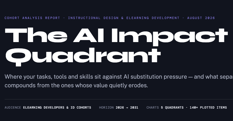
Plots where AI is creating the most disruption versus where adoption is still catching up, across roles and industries.
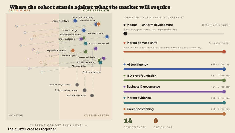
Factor Simulator
An interactive tool for adjusting scoring criteria and weights to see how a vendor or option would move across the quadrant.
Skills Portfolio Matrix
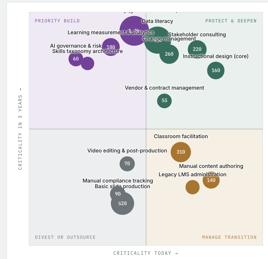
Maps individual or team skills by current proficiency against future demand, highlighting gaps and areas of over-investment.
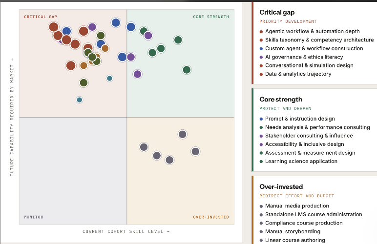
Cohort factors, future requirements
The axes are inverted from the previous quadrant report: X is current cohort skill level, Y is future capability the market will require.
AI ISD Capability Quadrant
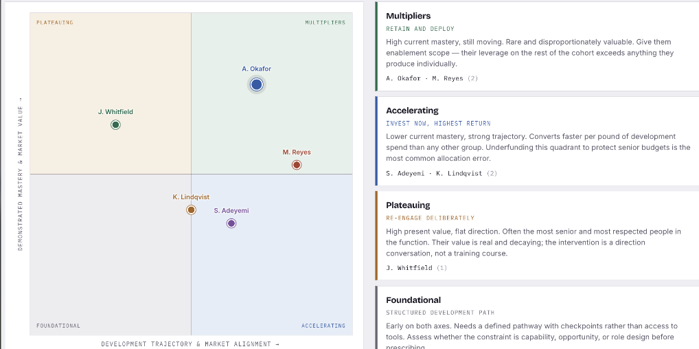
Positions instructional design capabilities against AI readiness, showing where ISD teams are strong and where they need to grow.